Graph depicting Education Spending Per-Student by Median Income
share on facebook
 
share on pinterest
 
share on twitter
 
share on reddit
 
share on tumblr
 
share on google+


< Previous Graph Next Graph >


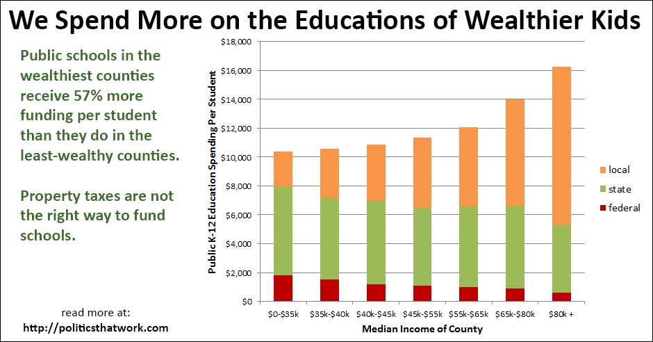
Taxpayers Provide 57% More Education Funding Per Student in Wealthy Counties


Description: This graph shows the funding public K-12 schools receive per student. Each bar represents a tier of counties, broken down by the median income in that county. The orange portion of each bar shows the local funding the schools in that county receive per student, the green portion of the bar shows the funding from the state and the red portion shows the funding received from the federal government.

Various outlying school districts, such as very small districts and districts serving exclusively special needs students have been removed from the sample to avoid distortion.

Sources: Census   Census

Data: Excel

Last updated: May 11, 2016

 
Related blog post: Blue States' Investments in Education Pay Off

Discussion: Public elementary, middle and high schools in counties with median incomes of over $80,000 receive $16,264 per student each year and public schools in counties with median incomes of less than $35,000 receive $10,382 per student.

The level of spending on education correlates directly to educational outcomes, to successfully completing college and hence to economic opportunity.

The federal government provides distinctly more funding to schools in low-income counties. States fund schools in a relatively flat manner, although they fund the schools in the wealthiest counties slightly less and the schools in the least-wealthy counties slightly more. Local funding, however, rises dramatically in wealthier counties. This effect is due to the fact that property taxes are a major source of funding for schools and, of course, property values are higher in wealthier counties.

Although the amount of federal funding is too low to level the playing field, the effect that it has in boosting up the funding of the least well-funded schools is one of the primary reasons for federal involvement in the funding of education. Eliminating federal funding for education, as Republicans often advocate, would make the disparity between schools in higher-income areas and lower-income areas even more dramatic. On the other hand, significantly increasing the role the federal government plays in funding education, assuming that the funds were allocated in a similar way, would help level the playing field.

These numbers do not include private education spending. Wealthier parents also spend more on education directly by hiring tutors, paying for test preparation courses and paying private school tuition.

Notably, these figures do not control for cost of living. Salaries and other expenses in the wealthiest counties presumably tend to be higher, which may explain a portion of the difference. However, the wealthiest areas are not uniformly the most expensive, nor are the least-wealthy areas consistently the least expensive. For example, poor urban areas typically have a high cost of living while wealthy suburbs sometimes have a reasonable cost of living.

The variation in funding levels shown here, for entire brackets of counties, obscure much larger differences between individual school districts. 134 school districts spend more than $30,000 per student on education. 12 school districts spend more than $50,000, and the best-funded district spends over $70,000 per year per student. Conversely, some districts spend less than $5,000 per student.


See more graphs about: Education   Inequality  


comments powered by Disqus