Graph depicting Best Presidencies for the Economy
share on facebook
 
share on pinterest
 
share on twitter
 
share on reddit
 
share on tumblr
 
share on google+


< Previous Graph Next Graph >


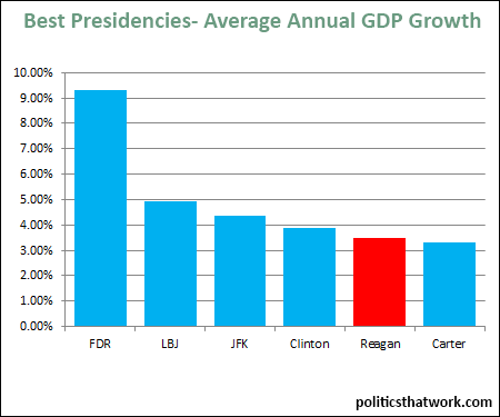
Description: This chart shows the top presidencies since 1929 arranged by average annual GDP growth.

Sources: BEA

Last updated: March 29, 2015


Top Presidencies for GDP Growth


Discussion: The top presidents' average annual GDP growth rates are as follows:

FDR9.29%
LBJ4.93%
JFK4.37%
Clinton3.88%
Reagan3.50%
Carter3.30%

Obviously, it is noteworthy that 5 of the 6 best have been Democrats. Also, it is plainly striking how dramatically FDR outperformed every other president.

One thing that I find interesting about this data is how dramatically differently the public perceives some very modest differences in our rate of economic growth. For example, much of the public believes that the economic growth was "terrible" under Carter and "great" under Reagan, but the economy actually grew at almost identical rates during those two presidencies (3.3% vs. 3.5%). It is hard to imagine that the typical American could actually detect the difference between a GDP growth rate of 3.3% and 3.5% while going about their day-to-day lives.

In case you are wondering, the worst president for GDP growth was, of course, President Hoover with an -5.38% average.


See more graphs about: GDP  


comments powered by Disqus