Which Political Party Has Created More Jobs?
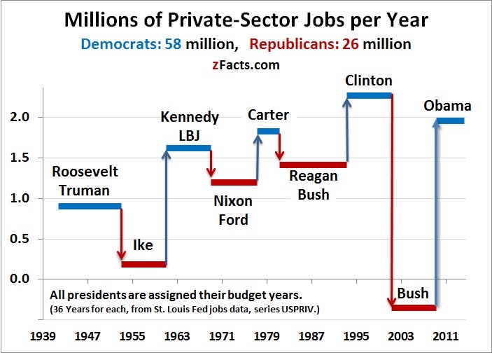


The graph above is the work of Economist Steven Stoft of zFacts.com. It shows the average annual rate of private sector job creation during each spell that a party held the presidency. Dr. Stoft created this data by analyzing 72 years worth of jobs data from the Bureau of Labor Statistics. 72 years was selected as the timeframe because each party has controlled the presidency for 36 of those 72 years. During those 36 years each, 58 million jobs have been created under Democratic presidents, but only 26 million jobs under Republican Presidents. That means that for all of modern American history, jobs have been created more than twice as fast when we have elected Democrats to the highest office.
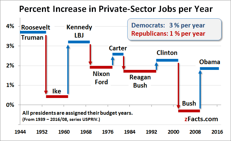
Another way to look at the same data is to consider job growth in terms of the percentage change in the number of jobs held during the period that each party controls the executive branch:
(click on any graph to see more details)
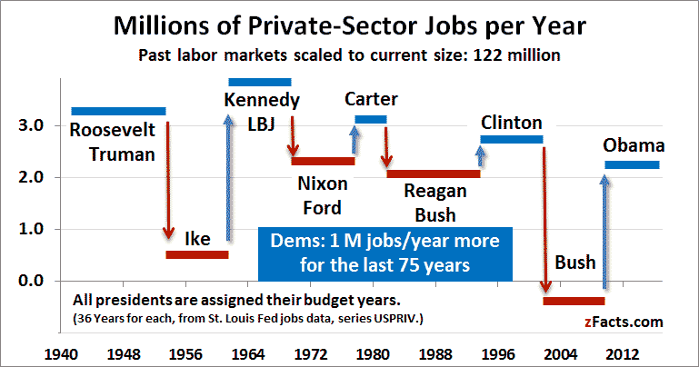
Because the population always increases, more recent presidents tend to have higher absolute numbers of jobs created than older presidents. If we scale the numbers to the current size of the labor force if 122 million, then the graph looks as follows:
(click on any graph to see more details)
Even after scaling the data to the current size of the labor force to avoid historical distortion, Democratic presidents still have created approximately 1 million more jobs per year.
As on the first graph, the Democrats are consistently outperforming the Republicans, but, it is notable that as a percentage, job growth is generally slowing.
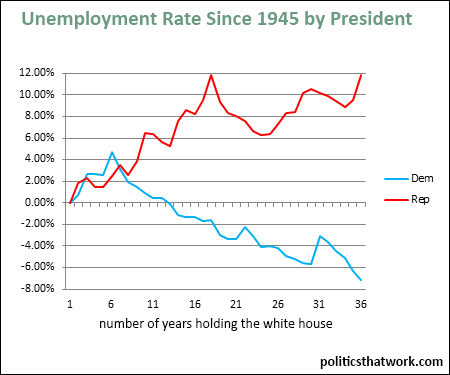
The findings of Dr. Stoft above align very well with the findings of Politics That Work. Dr. Stoft's numbers match up to Politics That Work's analysis of job creation by president. The same pattern emerges if you look at how the unemployment rate has shifted under presidents of each party:
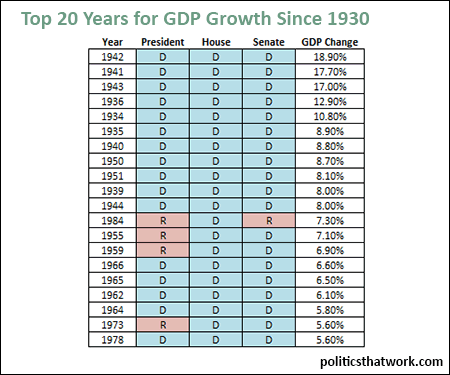
The gulf between the economic records of the parties is not limited to jobs. In fact, Democrats consistently outperform Republicans by every economic measure both at the state and federal levels. For example, this chart shows which party was controlling each house of the legislature and the executive branch during our 20 best years for GDP growth since 1930:
The same pattern emerges regardless of whether you look at the stock market, GDP growth, income growth, debt as a percentage of GDP or if you compare how the U.S. economy performs under the parties relative to our closest economic peers. The economy simply performs better- much better- under Democratic leadership.
You can learn more about how the economic records of the parties compare by reading the post here: Which Party is Better for the Economy?, or by picking up a copy of Mike Kimel and Michael Kanell's book Presimetrics.
Help get the word out. Share this page:
Updated: October 29, 2015