Graph depicting Life Expectancy by State
share on facebook
 
share on pinterest
 
share on twitter
 
share on reddit
 
share on tumblr
 
share on google+


< Previous Graph Next Graph >


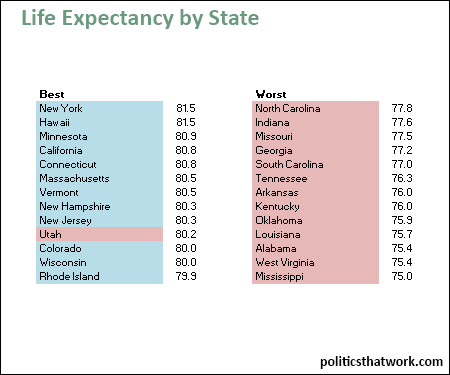
Description: This chart lists the 13 states with the longest life expectancy alongside the 13 states with the shortest life expectancy. The blue rows indicate states that voted for President Obama in 2012 and the red rows indicate states that voted for Governor Romney in 2012.

Sources: Measure of America

Last updated: January 28, 2015


Lifespans in Red and Blue States


Discussion: All of the 13 states with the shortest lifespans are red and 12 of the 13 with the longest lifespans are blue.

Politics are not the only thing that differs between these states. The states with long lifespans also tend to be wealthier. Blue states are generally wealthier than red states, so it can be difficult to separate the impact of policy from the impact of wealth.

However, the difference in wealth does not appear to explain the differences in lifespans entirely. There are wealthy red states, but they don't make the list of states with long lifespans. For example, Alaska has a median household income an impressive $17,714 higher than the national median, but its average lifespan is only 78.3 years- just barely better than the states on the 'worst' list. Conversely, there are less wealthy blue states, which do not make the 'worst' list. For example, New Mexico has an average lifespan just slightly better than Alaska (78.4 years) despite having a median household income $25,833 lower than Alaska does.

Utah may be the exception that proves the rule. Utah has a median income a smidge above the national median, but it appears among the states with long lifespans despite being solidly Republican. However, Utah created health insurance exchanges somewhat similar to those in the PPACA years ago. That Utah is the only red state on the 'best' list supports the premise that liberal healthcare policy has a positive effect on life expectancy.


See more graphs about: Health  


comments powered by Disqus