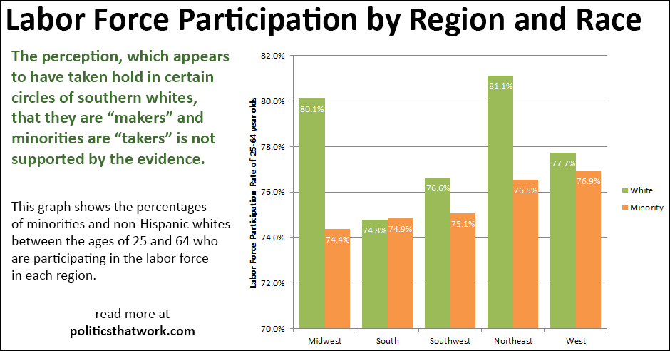
Labor Force Participation by Region and Race (ages 25-64)
Description: The bars represent the percentages of people, in the various groups, who are participating in the labor force. The green bars represent the rates of non-Hispanic whites. The orange bars represent the rates of black, Hispanic and Asian individuals. The bars are split into the five regions of the country.
The labor force participation statistic can be
highly misleading. It counts retirees and students as "non-participating" and it looks at all non-institutionalized civilians over the age of 15. That approach results in a much lower number, which can be misleading. To mitigate the distortion caused by differing levels of educational attainment and retirement between the regions, this graph looks only at the labor force participation rate of individuals who are between the ages of 25 and 64, since most education occurs before 25 and most retirement occurs after 65.
Sources: Census B23002H, B23002B, B23002I, B23002D
Data: ExcelLast updated: March 6, 2016