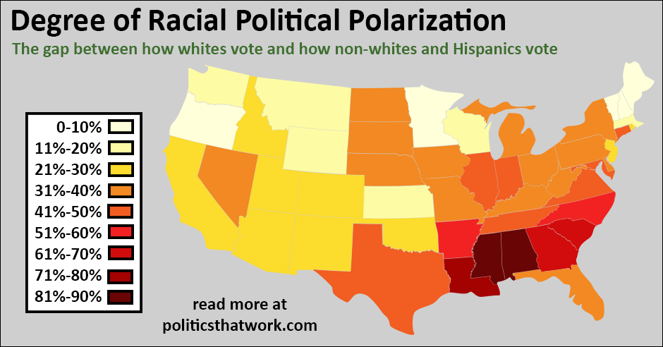
Racial Political Polarization
Description: The percentages reflected in the map are the difference between the percentage of non-Hispanic whites who responded to exit polls indicating that they had voted for President Obama and the percentage of non-whites or Hispanics who indicated that they did. For example, if in a given state, 40% of whites supported President Obama and 60% of minorities did, the degree of racial political polarization reflected on the map would be 20%.
The data comes from the 2008 exit polls. Unfortunately, no organization conducted exit polls in every state in 2012. The data file below contains the data from the states that did complete exit polling in 2012.
To clarify, the number of whites or minorities in a state does not affect these results. This shows the level of support President Obama had from each community as a percentage, so a state with a very small number of minorities whose political views differed markedly from the political views of whites would be just a polarized as a state with a large number of minorities whose views differed equally strongly.
Sources: CNNData: ExcelLast updated: October 25, 2015