Debunking Myths About the Labor Force Participation Rate
The labor force participation rate has been constantly in the news for the past several years. It is the GOP's standard retort to
news of dropping unemployment rates.
There is a great deal of misinformation floating around about this highly politicized topic and this blog post aims to clear some of that up.
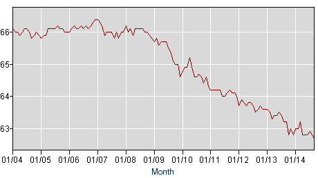
The Participation Rate is NOT the Ratio of Takers to MakersMany Republican pundits and politicians would have you believe that the participation ratio is essentially the line between "takers" and "makers." On one side lies the hard working "Real American" makers. On the other side of the line are the teeming masses of crack-smoking, disability-faking, welfare-baby-having, city-dwelling takers. The catch is, this depiction bears no relation whatsoever to the participation rate. In fact, the unemployed, welfare recipients and food stamp recipients are almost all on the "participating" side of the ratio and almost everybody on the "non-participating" side of the ratio is people the Republicans would classify as "makers." Somebody who works for 40 years and retires is classified as "non-participating." A high school senior is "non-participating," as is a medical student. Meanwhile, a person who is living off of TANF, but who applies for one job every month is "participating." Somewhat counter-intuitively, if you have 100 unemployed people, 90 of them get jobs and 10 of them go to Harvard, that is a drop in the participation rate.The Misleading BLS GraphIn addition to the confusion on the right about what the participation rate represents, the way that BLS presents the data visually adds to the misunderstanding: |
 |
That data is accurate of course, and it is the same data I use to create my graph below. However, in addition to the oddities of the way
the rate itself is determined, the graph shows only a narrow range of the vertical axis giving the impression that we are about to run
out of participating workers entirely when we hit the bottom, and it only covers the date range during which the rate has been falling
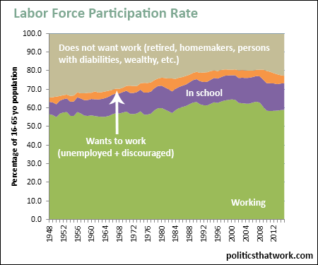
so people seeing it miss that the rate is still actually much higher than it has been for most of the previous decades.A More Meaningful Presentation of the Same DataThe graph below addresses the issues identified above to come up with a clearer representation of the same data. I separate out students from other non-participating people and I group together discouraged workers and unemployed people and split them out too. I also display the data going back to 1948 and I show the whole range from 0% to 100% instead of just 5% of the range. With those straightforward changes, here is the resulting graph: |

Sources: BLS BLS Census Census |
|
This graph shows the distribution of the entire non-institutionalized U.S. civilian population over 16 years of age into four categories- working, in school,
want to work and does not want work. The "wants to work" category includes both unemployed people and discouraged workers (people who report that they want a
job, but which have not applied for one recently). The "does not want work" category includes anybody who is not working and does not want to be. That would
retirees, homemakers, people with disabilities, people who are wealthy enough that they do not need to work, people taking time off to backpack around Europe
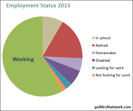
and so forth. Here is how it breaks down in 2015: |

|
|
Presented that way it doesn't quite give the same sense of a tiny and collapsing class of makers being submerged beneath the ocean of takers
that the BLS projection of the data does and it certainly doesn't look like it gives much support to the Republican rationale for ignoring
the dropping unemployment rate. October 17, 2015 | |


