Graph depicting The Myth of the Nation of Takers
share on facebook
 
share on pinterest
 
share on twitter
 
share on reddit
 
share on tumblr
 
share on google+


< Previous Graph Next Graph >


Detailed Breakdown of the Employment Status of Americans


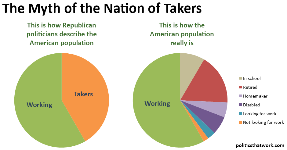
Description: These graphs show how every non-institutionalized American over 16 spends their time. The graph on the left breaks the population into working and non-working. The graph on the right breaks the non-working population down into more precise groups, such as students, retirees, and so forth.

The data is drawn from the 2015 Census Current Population Survey microdata provided by the University of Minnesota: Miriam King, Steven Ruggles, J. Trent Alexander, Sarah Flood, Katie Genadek, Matthew B. Schroeder, Brandon Trampe, and Rebecca Vick. Integrated Public Use Microdata Series, Current Population Survey: Version 3.0. [Machine-readable database]. Minneapolis, MN: Minnesota Population Center [producer and distributor], 2015.

Sources: 2015 Census Current Population Survey microdata IPUMS-CPS (full citation in description)

Data: Excel

Last updated: March 16, 2016

 
Discussion: Donald Trump claims that the "real" unemployment rate is 42%. Ben Carson has frequently implied that the "real" measure of employment is the labor force participation rate. Paul Ryan sets the number of "takers" at 60%. Mitt Romney says 47%. It is the overriding theme of the modern Republican Party that the nation is being dragged down by large numbers of people who have chosen to simply stop working and live off of "welfare." Many conservative pundits and politicians have made dire predictions about the future of the country if the "takers" cross the 50% line to become a majority.

But this worldview does not appear to have much of a basis in reality. If you simply look at the percentage of the population over 16 who are not working, you get the graph on the left, which does seem like it roughly supports the Republicans' view. However, the non-working category is much different than the Republicans would have you believe. The biggest block of the non-working population, by far, is retirees. The second-biggest category is full time students. The third- and fourth-biggest categories are disabled people and homemakers.

The orange slice of the graph on the right represents the percentage of the over-16 population who are not disabled, are not retired, don't have a job and are not looking for one. So, any person matching the stereotype of a person who just decides not to work and to live off welfare instead falls in that orange slice. But, it is important to note that not everyone in that orange slice is "on welfare." Mitt Romney, Donald Trump and Jeb Bush themselves are all three (I think) in that orange slice too- they don't have jobs, aren't retired, aren't disabled and aren't looking for jobs. At least, unless you call running for president "looking for a job." In fact, a pretty decent portion of that orange slice is made up of people who are not on public assistance. For example, people who take a couple months off after college to go backpacking or people who aren't looking for a job right now because they're moving soon, are also in that orange slice.


See more graphs about: Unemployment   Inequality  


comments powered by Disqus