Graph depicting Democratic Presidents Outperform Republicans by Every Economic Measure
share on facebook
 
share on pinterest
 
share on twitter
 
share on reddit
 
share on tumblr
 
share on google+


< Previous Graph Next Graph >


Democratic Presidents Outperform Republicans by Every Economic Measure


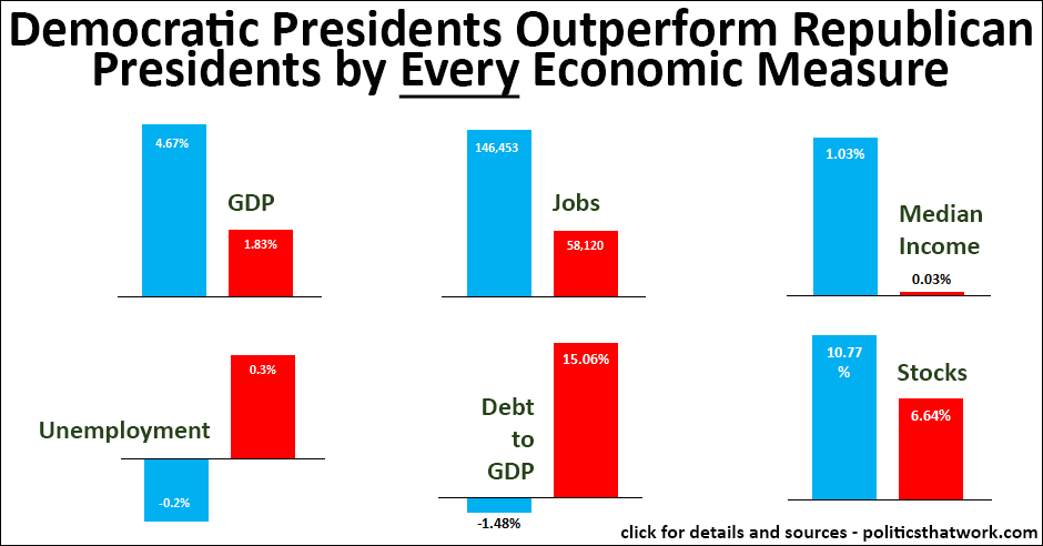
Description: Each bar graph compares the historical performance of our economy under Democratic presidents with the performance under Republican presidents. The blue bar represents the average performance under Democrats and the red bar represents the average performance under Republicans.

The GDP numbers represent the average annual GDP growth. The jobs graph shows the average monthly job creation. Median income indicates the average annual change in the average income of the middle 20% of Americans. Unemployment reflects the average annual change in the U3 unemployment rate (positive numbers are bad, negative numbers are good). The debt to GDP ratio shows the average annual percentage of change in the ratio of national debt to GDP (positive numbers are bad). Stocks reflects the average annual change in the value of the S&P index.

In each case, the data reflects presidents as far back as the data is available from that source. Most of the graphs show the average going back to either 1930 or 1950. The income data only goes back to 1968, and the debt data goes back to 1961. The exact years and figures are available from the "Excel" link below.

Sources: BEA   BLS   BLS   Treasury   Census   Yahoo

Data: Excel

Last updated: September 14, 2016

 
Discussion: The economy has consistently performed dramatically better under Democratic presidents ever since we have been tracking economic performance.

Median income has essentially not increased at all under Republican presidents while increasing by an average of 1% per year, after adjusting for inflation, under Democratic presidents. A more detailed breakdown of how income levels have changed under the parties, including the change for other income brackets, is available here.

Jobs have been created far more rapidly under Democratic presidents as well, with Democrats averaging 2.5 times more jobs being created each month. This figure could be somewhat misleading, given that two of the three most recent presidents have been Democrats, and the population is larger today than in the past. However, as you can see from a comparison of the presidents' jobs records it is not that simple- a number of Democratic presidents farther back in history beat more recent Republican presidents. For example, both President Carter and President Johnson beat all Republican presidents. In fact, only 2 of the top 8 presidents are Republican while all 4 of the worst 4 are Republican. So, the pattern appears to be fairly consistent.

The gross domestic product has also grown approximately 2.5 times as fast under Democrats. 5 of the top 6 presidents for GDP growth are Democrats with the best Democratic president having 2.5 times as much GDP growth per year as the best Republican president.

The dramatic gulf between the performance of the parties is not limited to the presidency. Democrats also dramatically outperform both at the state level and in the legislature.

The reasons the economy performs so much better under Democrats are a subject of much debate. Common explanations include a greater emphasis on expanding access to the benefits of economic growth to a broader slice of society, higher investments in societal foundations like education and scientific research and smarter regulation. But, whatever the explanation is, or the explanations are, the record is unequivocal.


See more graphs about: GDP   Unemployment   Income   Debt   Market  


comments powered by Disqus