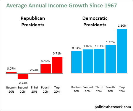


Description: This graph shows the average annual change in the real income of each fifth of the population during the presidencies of Republican and Democratic presidents between 1967 and 2013.
Sources: Census
Data: Excel
Last updated: March 16, 2016