Graph depicting Effect of Growing Inequality on Incomes
share on facebook
 
share on pinterest
 
share on twitter
 
share on reddit
 
share on tumblr
 
share on google+


< Previous Graph Next Graph >


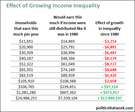
Description: This table shows the current household incomes of various percentiles for income in the left column, and what the income of people at that percentile would be if the distribution of income today were the same as it was in 1980 in the middle column. The right column shows the difference between what their income would be if the income distribution remained the same and what their income is today (i.e., a negative, red, number means that they are losing that much income to the increase in inequality). The rows represent the income of households at the 10th, 20th, 30th, 40th, 50th, 60th, 70th, 80th, 90th, 99th and 99.9th percentiles and the top 0.01% for income. Note that the 10th, 30th, 50th and 70th percentile figures are actually average figures for the quintiles, as the boundary figures are not available, and that the top 0.01% is the average for the top 0.01%.

The calculations are simple. I took the incomes at various percentiles as they stood in 1980, and applied the overall average increase in income of 28% to determine what those percentiles would earn today if the distribution had remained constant.

Sources: Census   Census   Saez

Data: Excel

Last updated: March 16, 2016


The Effect of the Growth in Inequality Since 1980 on Incomes


Related blog post: Inequality in America

Discussion: Income growth has been drastically skewed since 1980 with the average income of the bottom 90% actually falling 5% while the average income of the top 0.01% rose by 325%. Today, every household that earns less than approximately $112,000 a year would earn more today if income were still distributed the way it was in 1980. The people in the lowest quintile would make, on average, 28% more income, the median American would make 17% more income, and households earning $100,000 a year would make 3% more income. However, the average member of the top 0.01% would make 70% less income.

The starting year of 1980 is chosen because it is immediately prior to the drastic implementation of supply side economic policy championed by President Reagan- better known as "trickle down economics" at the time, and generally referred to today by Republican politicians as "rewarding job creators." At the time, Republicans believed that trickle down policies which steered more of the income to the wealthy would speed up economic growth, however, it is now widely recognized that it actually has been slowing economic growth. In fact, contrary to the core assumption of supply side economic theory, growth has actually tended to be faster in years when taxes on the rich have been higher. This table does not attempt to calculate how much more income each percentile would have if trickle down economics had never been implemented, but the numbers would likely be much higher, possibly even for the top bracket. Instead, this table shows only where incomes would land if we now revised tax and other policy to restore the distribution of income we had in 1980.

To be sure, there was already extreme inequality in 1980. Rolling back to that distribution would still leave the wealthy massively more wealthy, and with radically higher incomes, than the upper middle class. The wealthy have already amassed an enormous portion of the nation's wealth since 1980 and even with tax and other policies to restore a more sensible distribution of income, that wealth would still be in place.

Returning to a distribution of income similar to the distribution we had in 1980 would also have considerable positive effects on the federal budget. For example, fewer people would require food stamps and TANF, fewer people would require subsidies for health coverage and social security revenues would rise.

You can read more about economic inequality on this site's post on inequality in America or by picking up any or all of the following books: Thomas Piketty's Capital, Joseph Stiglitz's The Price of Inequality and David Cay Johnston's Divided: The Perils of Our Growing Inequality.


See more graphs about: Income   Inequality  


comments powered by Disqus