Graph depicting Share of the Nation
share on facebook
 
share on pinterest
 
share on twitter
 
share on reddit
 
share on tumblr
 
share on google+


< Previous Graph Next Graph >


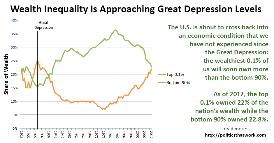
The Wealthiest 0.1% Is About to Hold More Wealth Than the Bottom 90% for the First Time Since the Great Depression


Description: The green line shows the share of the nation's wealth that is held by the least-wealthy ninety percent of Americans combined and the orange line shows the share of the nation's wealth that is held by the wealthiest one tenth of one percent of Americans.

The horizontal lines mark the start and end of the Great Depression. The Great Depression started in 1929. The year it ended is debatable, but the line is marked at 1939, which is typically the latest date cited.

Sources: Saez and Zucman

Data: Excel

Last updated: April 17, 2016

 
Discussion: As of 2012, the latest year for which there is data available, the top 0.1% of Americans by wealth owned 22% of the nation's wealth while the bottom 90% combined owned 22.8%. We are either about to cross over that line imminently or we already have.

Wealth inequality has not been this extreme since the Great Depression. The share of the wealth held by the bottom 90% began to fall in the early 1980s. Since then, the top 0.1%, and especially the top 0.01%, have seen a massive explosion in their wealth while the wealth of the bottom 90% has remained essentially unchanged.

Incomes have also greatly diverged during this time frame. This has not been the result of a lack of productivity by the bottom 90%. Since approximately 1970, increases in worker productivity have ceased to yield increases in income.

This data does not, of course, mean that we are about to have another Great Depression or that life will be analogous to life during the Great Depression. The median income is much higher today than it was then and while inequality undeniably played a role in triggering both the Great Depression and the Great Recession, there were many other factors involved as well. However, it is important to note that the greatest years for economic growth in the United States all occurred during the era when the share of income held by the bottom 90% was growing. Since we turned that corner, GDP growth has been relatively mediocre. That is not entirely surprising given that having a highly incentivized workforce and strong consumer spending have always been central factors in our country's economic success, and both of those factors are largely determined by how the wealth is distributed.

The causes of inequality are complex, but among them seem to be the weakening of organized labor and the undermining of our safety net spending. A more detailed discussion of inequality can be found here: Inequality in America.


See more graphs about: Wealth   Inequality  


comments powered by Disqus