Change in the Division of Income Between 1980 and 2013
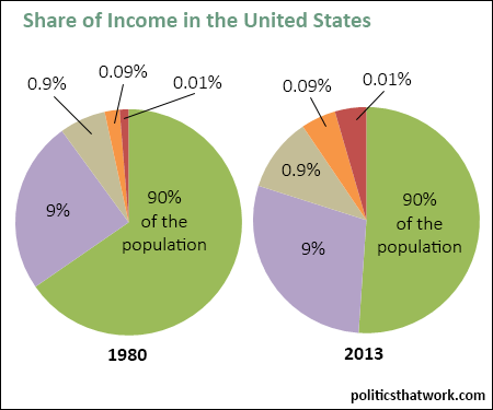
Description: These two pie charts show how the household income in the United States is distributed. The pie chart on the left shows the distribution in 1980 and the pie chart on the right shows the distribution in 2013. The green wedges show the portion of the income received by the bottom 90% of the population, the purple wedge shows the portion held by the 90th to 99th percentile, the grey wedge represents the share held by the top 1%, excluding the top 0.1%, the orange wedge shows the top 0.1% excluding the top 0.01% and the maroon wedge shows the portion of the income received by the top 0.01% of the population. The numbers reflect real household income before taxes excluding in-kind and government transfers.
Related blog post: Inequality in AmericaDiscussion: The distribution of income in the United States became dramatically more concentrated between 1980 and 2012. The portion of the income received by the bottom 90% of us decreased from 65% to 51% while the portion received by the top 1% doubled, the portion received by the top 0.1% tripled and the portion received by the top 0.01% quadrupled.
This data is drawn from an update that Professor Emmanuel Saez released to data accompanying a paper published by himself and Thomas Piketty entitled Income Inequality in the United States, 1913-2002 (2004). The data can be found at the link to the left.
This chart shows the change in each bracket's share of the income. You can see the change in each bracket's absolute income here.
You can also see the way that the division of the nation's wealth changed during the same time period here.See more graphs about: Income Inequality