Visualizing the Sizes of the Red and Blue State Economies
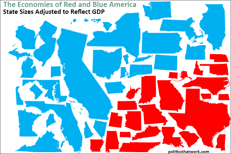
Description: This image shows all 50 states with their sizes adjusted such that the area of each state is proportional to its GDP. The GDP data is from 2013. The states which supported President Obama in the 2012 election are colored blue and the states which supported Mitt Romney in 2012 are colored red.
Sources: BEA
Last updated: February 5, 2015
Discussion: In total, the blue states have a GDP of $11,1 trillion while the red states have a GDP of $5.6 trillion.
It is important to note, however, that part of the reason the blue states take up so much more of the image is that the Democrats won in 2012 and thus more states, and more of the country's population, are blue. 200 million people reside in the blue states and only 115 million live in the red states. If the states were split into blue and red based on the 2014 congressional or gubernatorial elections, more states would be red.
However, in addition to having more population, blue states also have higher GDP per person. The average GDP per person for a blue state is $55,194 and the average GDP per person for a red state is $48,725. The blue states also have a much deeper lineup in terms of GDP. Seven blue states have GDP's over $500 billion- California, New York, Florida, Illinois, Pennsylvania, Ohio and New Jersey. Only one red state has a GDP over $500 billion- Texas. In fact, Texas produces 27% of the entire GDP of the red states. Among the blue states, although California produces $670 billion more GDP per year than Texas, it still only constitutes 20% of the GDP of blue states.
This image, like the ones that adjust the map for population, provides a different perspective than the typical election result maps that show the geographic space in which each party wins. This image also makes it clear how ridiculous the Republican's contention that Republicans are generally "makers" and Democrats are generally "takers" is. To be clear, we don't know from this data how much of the GDP is created by Republicans in each state vs. Democrats in each state. But, many of the most liberal cities and states have the highest GDP's per capita. For example, in the most recent mayoral election in San Francisco (2011), the two Republican candidates combined received 0.5% of the vote, and San Francisco has one of the highest GDP's per capita of any city. Clearly, we do not live in a country where either party has a monopoly on "makers" and if anything, the more liberal areas tend to have a slightly more productive citizenry.
These results are consistent with the general tendency for the economy to perform better under Democrats. It is also consistent with the correlation between education and economic productivity at the state level.
See more graphs about: GDP
Political and Economic News
EPI: The Tax Cuts and Jobs Act isn’t working and there’s no reason to think that will change
CNN: Trump ordered Mattis to screw Amazon
Elijah Cummings: We are in a fight for the soul of our democracy
Pro Market: The Cost of America’s Oligopoly Problem
...more


