Graph depicting How American Workers
share on facebook
 
share on pinterest
 
share on twitter
 
share on reddit
 
share on tumblr
 
share on google+


< Previous Graph Next Graph >


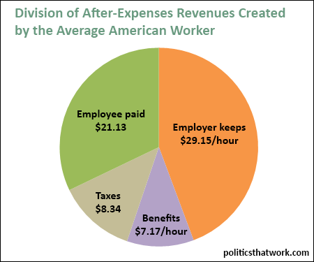
Description: This pie chart shows how the productivity, after expenses, of the American worker is split up. Productivity represents the value added by the worker per hour. It represents how much more value the outputs of the worker's activity has than the inputs. It can be calculated by dividing the nation's GDP (excluding certain external inputs) by the number of hours worked in the nation. Note that the taxes identified are the individual's taxes and do not include the employer's taxes. The taxes include state, local and federal taxes and FICA. The "employee paid" slice of the pie is the post-tax take home pay of the employee.

Sources: Conference Board   EPI   Tax Policy Center   Tax Foundation   Quartz

Last updated: March 16, 2016


How the Value Workers Create is Split up Between Employee and Employer


Related blog post: Inequality in America

Discussion: The average American worker generates $65.79, after non-labor expenses are paid, for every hour that they work. While that number- the average worker productivity- has been steadily rising ever since they started tracking it, the share that goes to wages has been steadily falling.

Employers, of course, use a share of revenues to cover expenses. That share can be very high or very low depending on the industry. This chart, however, shows only what is left over after all non-labor expenses have been paid. Employers keep 44% for themselves. That does not mean that employers on average walk home with $29.15 in their pocket for every hour an employee works for them. Many employers prefer to reinvest a portion of that money in increasing the value of the company. But, reinvesting money in increasing the value of an asset they hold is still a form of profit. Their net worth increases by whatever amount they spend expanding the business that they own. Employers, like employees, pay for their benefits and taxes as well and those things would come out of the orange slice of the pie chart.

One interesting aspect of this chart is that it shows the average tax burden of a worker in proportion to the full value that the worker creates rather than as it is usually displayed- in proportion to the taxable portion of the worker's income. The average American pays 30% of their income to taxes between the state, local and federal levels. That sounds like a somewhat onerous burden. But, another way to look at it is that the worker's taxes only eat up 13% of the total value the worker produces. It is interesting to consider this number in comparison to the 44% that employer profit taking consumes.

You can read more about economic inequality on this site's post on inequality in America or by picking up any or all of the following books: Thomas Piketty's Capital, Joseph Stiglitz's The Price of Inequality and David Cay Johnston's Divided: The Perils of Our Growing Inequality.


See more graphs about: Income   Inequality  


comments powered by Disqus