Graph depicting Education Spending and Math Proficiency
share on facebook
 
share on pinterest
 
share on twitter
 
share on reddit
 
share on tumblr
 
share on google+


< Previous Graph Next Graph >


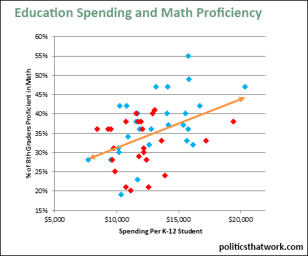
Description: This graph correlates the amount states spend per student on education with the percentage of 8th graders who are proficient at mathematics. The blue dots represent states that President Obama won in 2012 and the red dots represent states that Mitt Romney won in 2012. The orange line is the trend line, representing the average impact of each level of spending. The spending levels have been adjusted for cost of living.

Sources: Annie E. Casey Foundation   NEA   BEA

Data: Excel

Last updated: March 10, 2015


Education Spending Raises Math Scores


Related blog post: How Blue States Are Outperforming Red States

Discussion: Every state in which 30% or fewer of the 8th graders pass the proficiency test spends less than $12,500 per student while every state in which more than 45% of the students pass the test spends more than $12,500. While there are states that spend a lot and achieve middling results, as well as states that achieve middling results with very low spending, there are no states that achieve strong results with low spending nor states that achieve poor results with high spending.

It is frequently said that dumping money on schools does not fix problems with the educational system. This view is typically backed up with anecdotal evidence about school systems that spend a lot and do not achieve strong results. There may be some truth to a limited form of this theory. It could be that it depends what the school spends the money on, and that some states spend a lot in ways that do not improve the quality of education. However, it could also be that the school systems that spend a lot and still only have middling results would have much worse results were spending lower.

What we can say for sure is that spending above our current average appears to be a prerequisite to achieving the best results. If the goal is to move all the states into the 45%+ category, we need to increase funding in nearly all states.

There is also a clear partisan split with the red states being clustered in the low spending/poor results corner and blue states stretching up into the high spending/good results corner. As a random side note, the two red states with high educational spending are Alaska and Wyoming. Both of those states have extremely widely dispersed and small populations, which likely explains the high costs.


See more graphs about: Education  


comments powered by Disqus