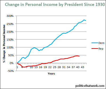
Change in Disposable Income Since 1930 by the Party of the President
Description: This graph shows the changes to the average personal income in the U.S., adjusted for inflation, since 1930. It is split up between years in which Republicans were president and years in which Democrats were president. For each party, it has been calculated as if the years during which the opposing party held the White House had not occurred.
Related blog post: Which Party Is Better for the Economy?Discussion: Personal or "disposable" income is the amount of income left over after all income taxes have been paid. Notably, it does not exclude non-income taxes such as sales taxes or property taxes, which can be significant in some states.
In the 44 years that we have had Democratic presidents since 1930, the real per-capita disposable income has increased 271%. During the 40 years during which we have had Republican presidents, it has increased 44%. On average, it has increased 3.1% (after adjusting for inflation) under Democratic presidents and 1% under Republican presidents.
You can also see how the income growth has been divided between the income brackets here.See more graphs about: Income