Graph depicting Support for Equal Marital Rights
share on facebook
 
share on pinterest
 
share on twitter
 
share on reddit
 
share on tumblr
 
share on google+


< Previous Graph Next Graph >


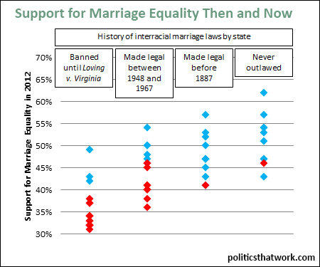
Description: This graph shows the level of support for legally recognizing same sex marriage by state in 2012 with states grouped based on the year in which each state began to legally recognize interracial marriage. The left column includes the states which maintained anti-miscegenation laws until they were found to be unconstitutional by the Supreme Court in 1967 by the Loving v. Virginia decision. The second column contains states that repealed its anti-miscegenation laws- either by legislation or judicial decision- between 1948 and 1967. The third column contains the states which repealed their bans on interracial marriage prior to 1887. The right column contains states which never prohibited interracial marriage. The blue dots indicate states which supported President Obama in 2012 and the red dots indicate states with supported Mitt Romney for president in 2012.

Sources: Tennessee Secretary of State   UCLA

Data: Excel

Last updated: January 28, 2015


Support for Interracial and Same Sex Marriage by State


Discussion: The level of support for same sex marriage rights indicated was the level in each state in 2012. Support has increased in all states since that time.

The correlation between historical opposition to interracial marriage and present day opposition to same sex marriage is fairly strong. However, the results should not be overstated. For example, interracial marriage was not recognized in Delaware until Loving v. Virginia, but the level of support for same sex marriage in 2012 was 6 points higher in Delaware than it was in Minnesota despite the fact that Minnesota never prohibited interracial marriage. (As a side note, Minnesota caught up with the other progressive states shortly after this poll was taken and voters rejected a constitutional amendment to ban same sex marriage in the same year) Nonetheless, there does appear to be a tendency that the states which were slower to recognize interracial marriage are generally slower to recognize same sex marriage as well.

The states in the bottom left corner (the states which have been slow to recognize both interracial and same sex marriage) are generally the southern states and the states in the top right (the states which were fast to recognize both forms of marriage) are generally the northeastern states. The very most progressive state, in the very top right, is not actually a state, it is the District of Columbia. The very least progressive state, in the very bottom left, is Louisiana.

Unsurprisingly, today's blue states tend to be clustered in the more socially progressive top right corner and red states tend to be clustered in the more socially conservative bottom left corner.


See more graphs about: Diversity  


comments powered by Disqus