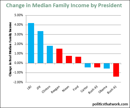
Graph depicting Change in Median Income by President
share on facebook
 
share on pinterest
 
share on twitter
 
share on reddit
 
share on tumblr
 
share on google+


< Previous Graph Next Graph >


Description: This graph shows the average annual change in the real median family income for each of the 10 most recent presidents.

Sources: Census

Data: Excel

Last updated: March 29, 2015


Median Income Growth by President


Discussion: The three best presidents for median income were Democrats and five of the seven worst were Republicans. On average, the median family income increased by 1.7% per year when Democrats were in the White House and 0.8% when Republicans were. You can see how the changes in income were distributed across the income quintiles here.

The most notable thing about this data might be how dramatically President Johnson and President Kennedy outpaced every other president. During LBJ's presidency, the median family income grew by an astounding 4.21% per year. JFK was not far behind at 3.34%. Then it drops down to Clinton at 1.81% and Reagan at 1.53%.

Another interesting thing is that Bush 41 (George H.W. Bush) had by far the worst performance: losing 1.39% each year. Typically Bush 43 (George W. Bush) holds the last place on comparisons of this type.

It is also important to note that the data set currently only has data up to 2013. Median incomes increased slightly in 2014, so President Obama's bar is likely already a bit less negative and presumably will be in a better position by the time he leaves office.


See more graphs about: Income  


comments powered by Disqus