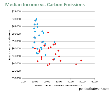
Carbon Emissions Per Capita Compared to Median Household Income
Description: Carbon emissions per person, per year, in metric tons, are correlated to median income for each state. The graph contains only states with populations of over 750,000. This means that the chart excludes Wyoming, Vermont, the District of Columbia, North Dakota and Alaska. These states were removed partly for readability (Wyoming would be way off to the right of the chart), but primarily because it is easy to skew the per capita emissions figure for states with such small populations. For example, Wyoming emits more than twice as much carbon per person as any other state because a handful of large industrial facilities swamp the tiny population. North Dakota and Alaska are also somewhat misleading because of the huge oil booms and tiny populations. On the other end, DC is misleading because it is all urban.
Discussion: Wealthier states clearly tend to have lower carbon emissions. It could be that wealth has enabled those states to adopt more efficient technology or to accept greater costs of reducing emissions. On the other hand, it could be that both low emissions and high median income are caused by other factors such as population density.
See also carbon emissions and politics.See more graphs about: Environment Income