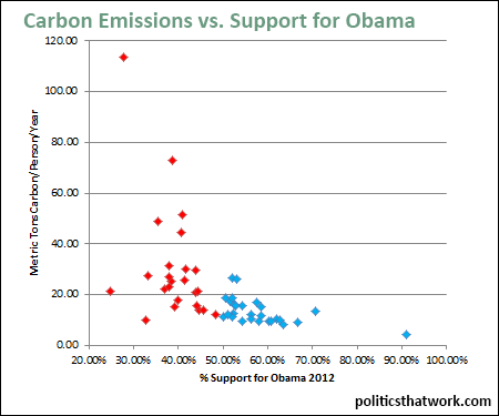
Correlation Between Carbon Emissions Per Capita and Support for Obama
Description: Carbon emissions per person, per year, in metric tons, are correlated to the percentage of the vote received by President Obama in 2012.
Discussion: The most simplistic explanation for why carbon emissions per capita seem to have such a clear relationship to support for President Obama would be that President Obama advocated for measures to address climate change, so people who care more about climate change both vote for Obama and reduce their own emissions. Perhaps measures to address climate change alienate people who depend heavily on fossil fuels from the Democratic Party or perhaps people who are alienated from the Democratic Party are less prone to attempt to address their carbon footprint as some kind of protest statement.
However, it is more complicated than that. People in rural areas tend to have high carbon emissions and tend to be conservative where people in urban areas tend to have low carbon emissions and also to be liberal.
Perhaps the graph also suggests that one's views of politics and even science can be shifted for convenience- a person who consumes a lot of fossil fuels might not want to believe that it is causing harm to the climate while a person who uses little fossil fuel might be more open to the idea.
See also carbon emissions and median income.See more graphs about: Environment