Graph depicting Where our GDP goes
share on facebook
 
share on pinterest
 
share on twitter
 
share on reddit
 
share on tumblr
 
share on google+


< Previous Graph Next Graph >


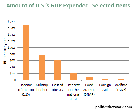
Description: This graph represents the amount of the U.S.'s GDP that is dedicated to various categories of costs from the income collected by the top 0.1% to the direct and indirect costs created by obesity to TANF.

Sources: Pew Forbes About.com Washington Post HHS Mulbrandon National Priorities/USAID

Last updated: January 28, 2015


income of the top 0.1%, military spending, service on the debt, welfare spending, and other


Discussion: The purpose of this graph is to put the amounts of money that go to these categories in context. It is easy to just gloss over large numbers and start thinking of millions, billions and trillions all as 'a lot of money,' but when you see them in a single graph it is easier to see how they stack up.

Note that the 'welfare' column is only the Temporary Assistance for Needy Families (TANF) budget. TANF used to be AFDC, which is actual 'welfare'- the program where you get a check on the first of the month to offset poverty. There are other programs that people have taken to calling 'welfare' in recent years, but it is difficult to nail down exactly which programs they include. For example, some of the statistics about 'welfare spending' that get released by the Republicans include things like social security. Anyways, the point is just that this column represents only the actual 'welfare' program, not all spending on poverty amelioration or all safety net programs.

Also note that the 'cost of obesity' column represents the total cost, not just the portion paid by the government. It includes estimates of absences from work caused by obesity, medical costs, and other types of costs. The Forbes link on the left explains it in more detail.

Lastly, note that the 'military budget' column is potentially a mild underestimate. There is a fair amount of military spending that is not part of the budget of the DoD. For example, the Department of Energy has responsibilities related to nuclear weapons that perhaps ought to be considered part of our military spending, but which are not included in this number. Also, a portion of the foreign aid column arguably should be moved into the military column because that it is aid specifically used for strategic military purposes rather than humanitarian purposes.


See more graphs about: Spending  


comments powered by Disqus