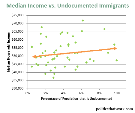
Description: This scatter chart compares the percentage of each state's population that is undocumented against the median household income of that state. The orange line indicates the trend. On average, having more undocumented immigrants correlates with higher median income.
Sources: Census and Pew Hispanic
Data: Excel
Last updated: December 31, 1969


