Graph depicting Carbon Emissions Per Person and Acceptance of AGW
share on facebook
 
share on pinterest
 
share on twitter
 
share on reddit
 
share on tumblr
 
share on google+


< Previous Graph Next Graph >


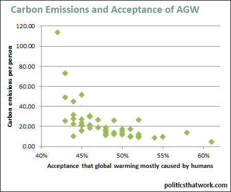
Description: The vertical axis shows the number of metric tons of carbon emitted per capita for each state and the horizontal axis shows the percentage of the states' population that agrees with the statement that recent global warming has mostly been caused by human activity.

Sources: EPA   Yale

Data: Excel

Last updated: August 19, 2015


Carbon Emissions Per Person and Belief in Man-made Global Warming


Discussion: People in states that are more reliant on fossil fuels tend to be less likely to accept the scientific consensus around anthropogenic global warming.

This correlation could reflect that people who accept AGW are more likely to take steps to reduce their carbon footprint. This could take the form of either individual steps to reduce one's emissions or the form of public policy. The correlation could also reflect that people who are more dependent on fossil fuels are more likely to rationalize their emissions by convincing themselves that AGW is not real. Most likely, both processes occur to some extent.

The correlation could also be the result of politics. More rural states tend to emit more carbon and also tend to be more conservative. The Republican Party very vocally expresses skepticism of climate science and that would presumably influence the people in states where the Republican Party holds more sway. It could also be partly explained by the tendency for people in more rural states to receive less education and the correlation between education level and acceptance of AGW.

The state with the very highest emissions, and the lowest level of acceptance of AGW (in the top left corner) is Wyoming. The dot in the bottom right, with the lowest emissions and the highest acceptance of AGW is the District of Columbia.

Learn about the inadequacy of the COP21 Paris pledges.


See more graphs about: Environment  


comments powered by Disqus