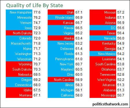
OECD's Quality of Life Index
Description: This table presents the Organization for Economic Cooperation and Development's (OECD) 2014 measure of the quality of life in each of the states and the District of Columbia. The score presented is the total of ten subscores- education, jobs, income, safety, health, environment, civic engagement, accessibility of services and housing. The red and blue color indicates whether the state supported President Obama or Mitt Romney in 2012.
Discussion: The U.S. as a whole fares very well for education (average score of the states- 9.0), income (8.9) and housing (9.0). It fares quite poorly for safety (4.1) and civic engagement (4.5). It has a middling performance for jobs (7.1), health (5.4), environment (7.5) and accessibility of services (7.1).
The states that have the lowest standard of living tend to be lagging the furthest behind in safety and health. The average state in the bottom 10 trails the national average by 2.9 points in safety and 2.6 points in health.
The results have a clear partisan skew. 24 of the top 34 states (the two left columns) are blue while 14 of the 17 bottom states are red. 9 of the top 10 states are Democratic and 9 of the 10 states with the lowest quality of living are Republican.See more graphs about: Well-being