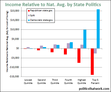
Income Quintiles Relative to National Average by the Politics of State (adjusted for cost of living)
Description: This graph shows how each quintile income bracket, and the top 5%, compares to the national average in states in which the Democrats control both the state legislature and the governorship, in which the Republicans do, and in which control is split. The numbers are adjusted for cost of living.
Discussion: People in every income bracket have higher incomes in states that are controlled by the Democrats than they do in states that are controlled by the Republicans, even if you adjust for cost of living. If you do not adjust for cost of living (and there are some sound arguments why you should not), the differences would be significantly more exaggerated.
In states where control is split, the bottom 60% of the income range earns slightly more and the top 20% earns dramatically less than in Democratic states. Split-control states also outperform Republican-controlled states in every bracket.
It is important to note that the current control of state governments is a bit unusual. The Republican Party has made significant recent gains. Some states that have traditionally been blue are purple and some states that have traditionally been purple are currently red. If those states were in the group they usually are, the blue and purple states would be outperforming the red states by a slightly wider margin.
As to why the blue states are performing better economically, there are many potential explanations, but the more significant investments blue states make in the future, such as investments in education, presumably play a role.See more graphs about: Income
