Graph depicting Patents Filed in Red and Blue States
share on facebook
 
share on pinterest
 
share on twitter
 
share on reddit
 
share on tumblr
 
share on google+


< Previous Graph Next Graph >


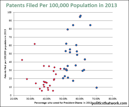
Description: This graph compares the number of patents filed in states in 2013 per 100,000 population with the percentage of the voters who voted for President Obama in 2012.

Sources: USPTO

Last updated: December 31, 1969


Patents Filed per 100,000 Population Compared to Support for Obama


Related blog post: How Blue States Are Outperforming Red States

Discussion: The gap in the number of patents filed per capita between red and blue states is profound. On average, people in red states file 21 patents per year for every 100,000 population while people in blue states file 46. The numbers are very similar if you look at the last 10 years instead of just at 2013.

Patents filed is an important measure of how vibrant the economy of a state is. States with cutting edge, highly innovative, economies file more patents than states focus on older, more established, industries. The cutting edge industries tend to be far more profitable.

There are many potential reasons for this gap. High on the list are that nearly all top flight universities are in blue states at present. Universities create a lot of patents, but more importantly, they draw in and train a lot of scientists, who then tend to stick around. Blue states have also tried to focus on higher tech industries while red states have tended to focus on industries like manufacturing and agriculture. Another possible explanation, explored in the blog, is that investment in education results in a more robust information economy and more innovation.

Whatever the explanation, the stark gap between the red and blue states in the pace at which they are creating intellectual property is a major feature of the U.S.'s current economic landscape.


See more graphs about: IP  


comments powered by Disqus