Graph depicting Income and Education by County
share on facebook
 
share on pinterest
 
share on twitter
 
share on reddit
 
share on tumblr
 
share on google+


< Previous Graph Next Graph >


Sources: Census S1501

Data: Excel

Last updated: April 30, 2017


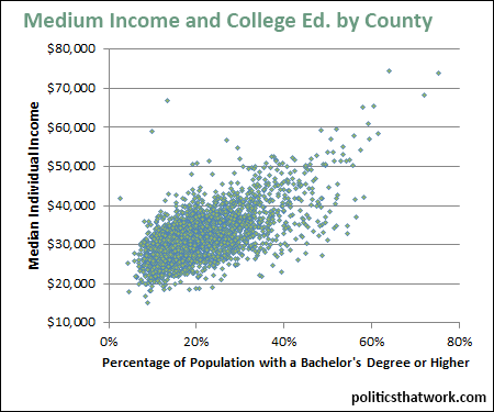
Median Individual Income and Percentage of College Graduates by County


Description: Each dot represents one county. The horizontal axis shows the percentage of each county's over-25 population that has a bachelor's degree or higher. The vertical axis shows that county's median individual income.

Related blog post: Blue States' Investments in Education Pay Off

Discussion: The correlation between educational attainment and income is overwhelming. Counties are mostly clustered between 5% and 35% for the percentage of the population that has a college degree, and generally have median individual incomes between $20,000 and $40,000. Within that subset, the counties at the high end for educational attainment have, on average, incomes approximately $10,000 higher. That tendency appears to continue all the way up the spectrum and counties where 70%-80% of the over-25 population have college degrees have median incomes over $65,000.

New York City, San Francisco and Washington, DC, and their suburbs, constitute 12 of the top 21 counties for the percentage of the population with a bachelor's degree or higher.

Presumably the relationship is bi-directional. The more educated the populace is, the more economic potential that county has and the more economic potential a county has, the more it draws educated workers.


See more graphs about: Education   Income  


comments powered by Disqus